So you’ve got an album or an EP or a single you’ve been slaving over and it’s ready for release, except you need one thing: artwork. That’s a stressful place to be if you haven’t given it any thought yet and you’re already feeling the inertia of progress fighting against the fear of losing any momentum to having to sort out the art, its logistics, and its cost. Art can be expensive, I get it! Hundreds or thousands of hours go into learning and honing a skill and craft, then god knows how many hours are dedicated to planning and making and revising the piece of art that eventually graces an album cover.
It can be incredibly easy to be duped into thinking that generative AI is an easy solution here. Frictionless. Your music is done, now you can just prompt out something and release it all now.
It is imperative that you do not do that.
This is not a post for the GenAI sycophants. You’ve already made up your mind, and I do not possess the rhetoric skills to convince you otherwise. People are shouting from the rooftops and scientific studies are published on how GenAI is bad, so if all that doesn’t move the needle for you, I seriously doubt I will.
This is for normal people who are feeling the grind and the squeeze of trying to be a creative in a late-stage capitalist hellscape and succumbing to the perceived convenience and presumed quality of AI to get album art done as cheaply and quickly as possible.
There are excuses from would-be-prompters. Most of them seem to revolve around the financial cost of art, or a person’s social circles and the lack of artists within. These are bullshit excuses. They are non-reasons. And I am going to lay them to rest right here, right now.
The bulk of this guide will go over completely free ways to get album art together. This is not a bullshit listicle, I am going to give you clear, concise, actionable instructions on how to pull together some artwork all by yourself for zero dollars. At the end I’ll even show a walkthrough of how I put together a logo, album art, and a cassette layout, for free.
Table of Contents
- 0 Budget-Friendly Paid Options
- 1 Free Ways to Get Album Art
- 2 Software & Tech
- 3 Literally A Guide To How I Made a Logo and Cassette Layout From Scratch, For Free, in an Afternoon
- 4 Conclusion
0 Budget-Friendly Paid Options
Okay first thing’s first: I’m going to immediately deviate from the framework I’ve just established. I know this post is titled specifically for how to get album art for a music release for free, but if you do have a bit of cash you’re willing to shell out, here are a few options that won’t break the bank. I won’t go into too much detail, but they are legitimate avenues to go about it without having to resort to using AI slop.
0.1 Hire A Friend
Homies help homies. If you’re making music, odds are you have friends IRL or that you met online that are also creatives. Someone probably does visual art. Remember, it doesn’t have to be a Seagrave-esque painting– maybe your friend works in charcoal, or collages. Maybe they’re a really talented photographer. Hell, maybe they just took an incredibly sick live shot of your band playing a gig that would work for a portion of the cover or layout.
Being your friend, they are also probably more willing to help you for cheaper than a stranger or by you repaying the favour elsewhere. Maybe a piece of art costs you helping them move across town next month. Or perhaps they have their own passion project they’re working on that needs music that you can provide. Who knows. Point is, friends generally like helping each other, so ask!
0.2 Fiverr
This is a bit of a dicey one these days, since Fiverr is filling up with losers using AI to generate images for you and then charging you for the pleasure. Yuck. However, if you have an eye for it and can vet out a good, reputable, human artist, you can get great work for cheap.
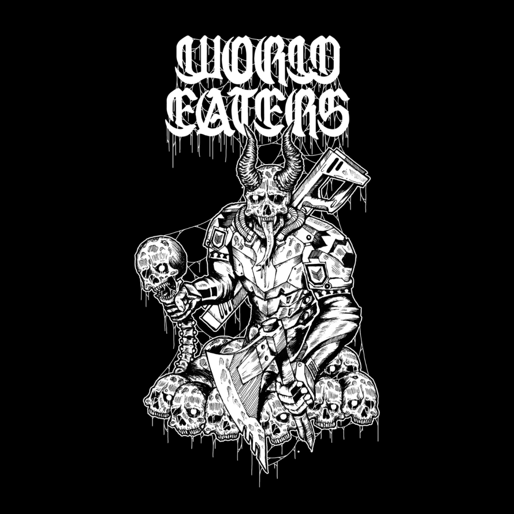
Back in 2020 I used Fiverr to hire Meytheus Rexy to make the logo for World Eaters, as well as make the drawing that would become the Demo Mk-1 artwork. Frankly, he knocked it out of the park and I had killer demo artwork that helped sell our first release to all the folks who didn’t know the band and kickstart our trajectory through the death metal underground. Beyond that, the artwork was good enough that we got it printed on shirts which subsequently were sold all around the world. And the total for the artwork, logo, and their source files came under $100 Canadian (that’s about $3.89 USD /s).
1 Free Ways to Get Album Art
Okay, our budget-conscious side-quest out of the way, let’s talk actual free ways to get your album some artwork.
1.1 Draw It Yourself
You’re an artist! Make art! It’s honestly as simple as that. Sure, maybe music is your medium of choice, but if you’re earnestly making music, you probably have the vision and attention to detail to guide your hand in sketching or drawing out your album art. You’ve already spent god-knows-how-long honing your craft with an instrument or software, so you know you can pick up and learn new skills. You’ve done it countless times before, this is just one more instance. It’s all there in you, all you need to do is try.
Remember that you don’t have to learn a medium like painting or charcoal to make a cool album cover– you can work in a digital medium using Photoshop (or any of it’s free alternatives, see below) which makes fixing little mistakes and iterating on a piece of art so much easier and low stakes.
Take a look at Miracle Fraud‘s debut, self-titled album. The cover is drawn by their drummer Benny and it fits their aesthetic perfectly. Minimalist, a little bit of 60s/ psych influence, featuring a weird little guy. It rules.
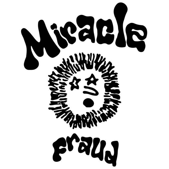
This cover also catches your eye in a way that a busy and crammed AI image would never. Among the myriad of punk albums that line the shelves of any given local store, the Miracle Fraud album pops with it’s no-frills layout and and fun vibe. If you’re relying on AI to make something, it’s going to spit out a congealed, smoothed out average of existing album covers, since that is the big limitation baked into GenAI. Sure it’s “cheaper” (it’s not!) but at least you’ll also get something that looks fucking bad and can be accidentally passed over in a store too.
1.2 Take A Photo
Photos have been used in album covers since photos and albums both existed. You likely have a smartphone with a good camera on it, all you need is something cool to point it at. If you have access to a higher quality camera, even better. Again, like drawing digitally above, this is super low stakes! Take a walk around your city or town, I guarantee you can find something interesting and engaging to take a photo of. You can snap hundreds of pictures in an hour long stroll and sift through them to see what’s hot and what’s not.
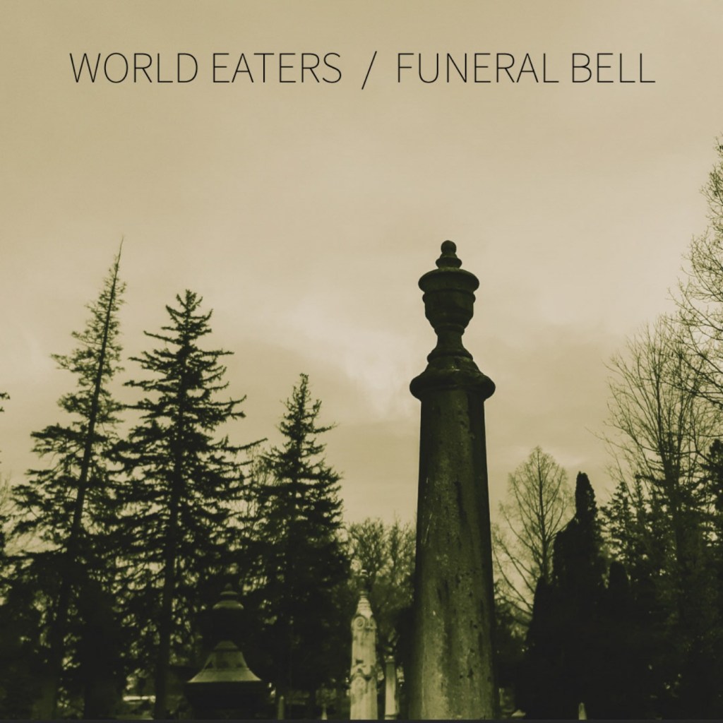
For World Eaters‘ 2020 split with Funeral Bell, Jeremy of Funeral Bell took a great picture of some headstones a graveyard (death/ doom and war metal fans rejoice in equal measure) and with a little colour correction (available natively in most phones’ gallery or camera apps), we have an ominous and sombre cover to use for a two song split. Our song “Orbital Bombardment” and Funeral Bell‘s “The Pestilence” both fit the aesthetic of a hazy, abandoned graveyard. Well done, Jeremy.
If you’re feeling a little more ambitious, stage something rather than just shooting nature and/ or architecture. Like I mentioned above, you’ve made the music, so you have the vision! You know what’s best for your project, and if you don’t immediately have an answer, that’s okay! You just need to think a little bit and the ideas will come. It’s a neat little feature of having a soul, try it sometime.
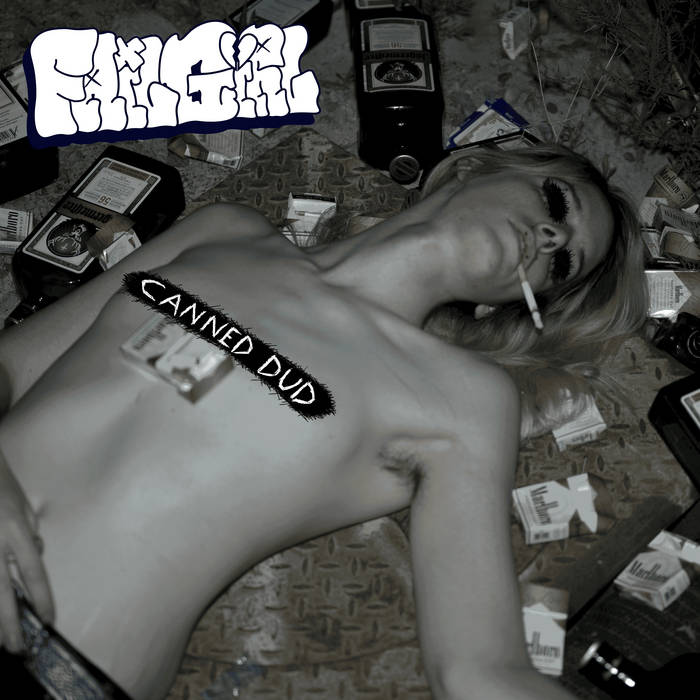
failgirl is a drug-addled and fuzzed out solo slacker rock project of Winter Stomp (World Eaters, Winter Lantern), and just look at the cover for its debut album canned dud. You can smell this fucking album cover (complimentary), and you immediately know what you’re getting into with the music. The songs are grounded and visceral, and this self-portrait is just perfect for showing the vulnerability and personality of this project and its creator.
So you don’t want to try your hand at drawing or painting something, and even just snapping a picture isn’t exactly the vibe that you want for your release’s artwork. AI sure seems like an easy way to get fully-realized (it won’t be) artwork.
If only there was a database or repository of fully realized artwork, free to use for anyone… if only…
There has to be some kind of domain of images… free to the public. Hmmm.
1.3 Use Public Domain Images
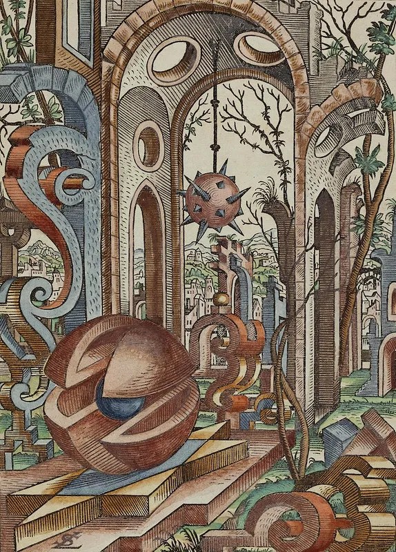
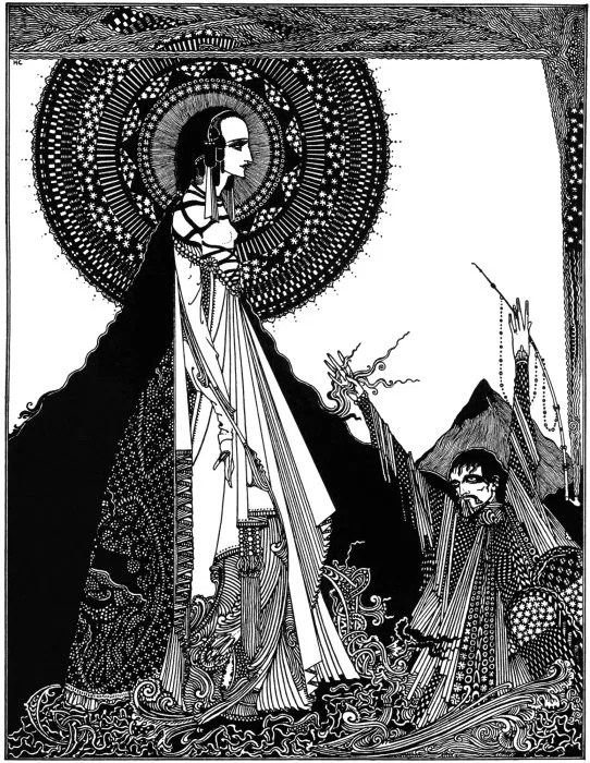
As of writing this, The Public Domain Image Archive has nearly eleven thousand free images to use. There’s an effective search function and an infinite scroll mode, so you can lose yourself for hours in there looking at cool shit.
I just spent about 3 minutes scrolling through the archive right now and found these absolute bangers. All for free. Like, earnestly and legally free. They are cropped down for the thumbnails on this page, but you can click each image to see the full version. Don’t tell me these wouldn’t make for sick art to use in an album cover.
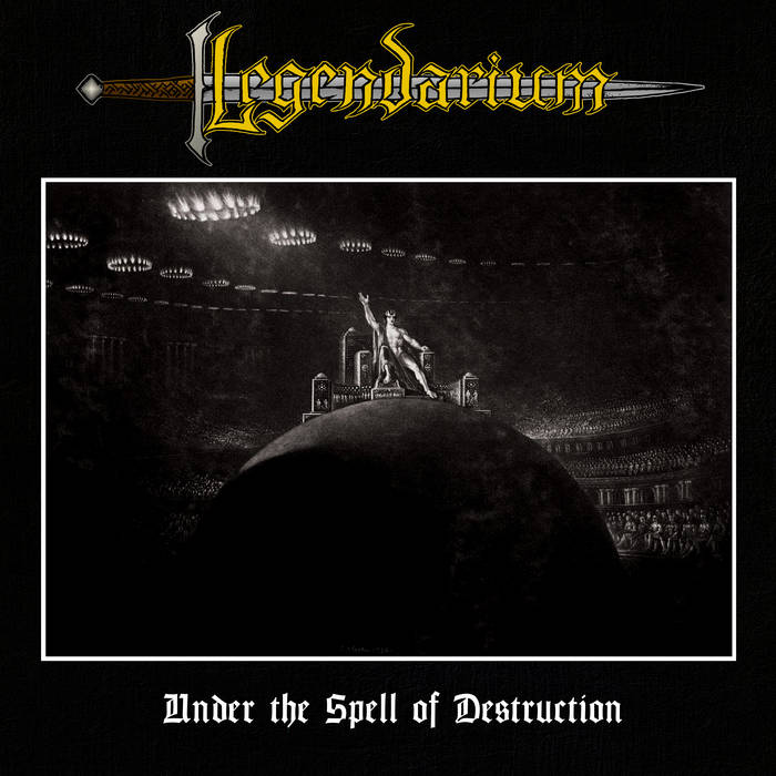
It doesn’t take much to see something really cool and get an idea for album artwork. Even by simply adding a border, logo, and the album title you can transform a cool public domain image into a bona fide album cover. See Legendarium‘s 2022 heavy metal opus Under the Spell of Destruction using a nearly 200 year old image in the cover to great effect. No need to raise a pencil or camera for this, simply just (again) a creative vision and a desire to make something great looking and representative of the music.
1.4 Just Use Your Logo
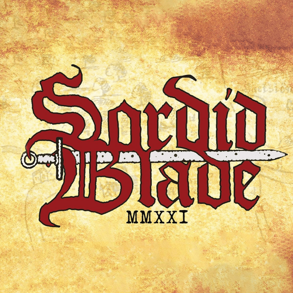
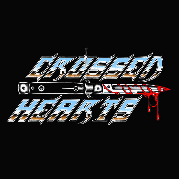
See below. This is a whole thing and it’s extrapolated on later in this post. For now, enjoy these covers that are just logos.
2 Software & Tech
2.1 Scanning Images
Your local library will have printers. Your friends may have printers. Maybe the office you work at has a printer that you can sneak a couple minutes on to make your album art. If you have a physical photo or object you think would be cool, you can just simply scan it. Making collages has been a part of album art culture for decades at this point, and doing something as simple as snipping and scanning images together can make for some great work.
You can also look at scan-to-PDF apps on your phone which have the intent of generating printable documents using your phone’s main camera. You can scan whatever you want into a high resolution PDF and use it however you see fit. Something like Adobe Scan (we hate Adobe here but it might be the default app on your phone like it was mine) can even support filtering and cropping.
2.2 Photoshop Alternatives
There are many, many free image editing programs out there of varying levels of quality and amount of features. This is just scratching the molecule on the very top of the tip of the iceberg.
2.2.1 Krita
Krita is a free and open source image editor and digital canvas program. It’s my image editor of choice due to it’s pretty shallow learning curve and ease of use. I am, after all, a musician first. I’ve used it to help with cassette layouts in the past for both World Eaters and other bands as well as making merch mock ups, gig flyers, and tour posters.
2.2.2 GIMP
GNU Imape Manipulation Program (GIMP) is another free image editor and legitimate competitor to Adobe Photoshop. I know folks who swear by GIMP, but for my tastes, the UI is a bit less intuitive than I’d like. There’s a higher skill floor to be up and running with this program, but once you learn it you’ll be able to execute pretty much any vision you can dream of with it.
2.3 One Lab
One Lab is a mobile app available on both iOS and Android which can make great glitched out and surreal images. I personally do not have any experience with One Lab, but World Eaters guitarist Jacob uses it regularly (he has recently been commissioned to make album artwork for a Toronto-based pop musician) and posts artwork under the name goodshadow_.
So, now that I’ve shown a few different paths you can go down to get free album art without resorting to using AI junk, you might be sneering that it’s easier said than done and it’s still a nigh-insurmountable obstacle or that you still have reservations about doing it because it’s a whole new medium to explore and skillset to learn. Well, too bad, because I now present to you:
3 Literally A Guide To How I Made a Logo and Cassette Layout From Scratch, For Free, in an Afternoon
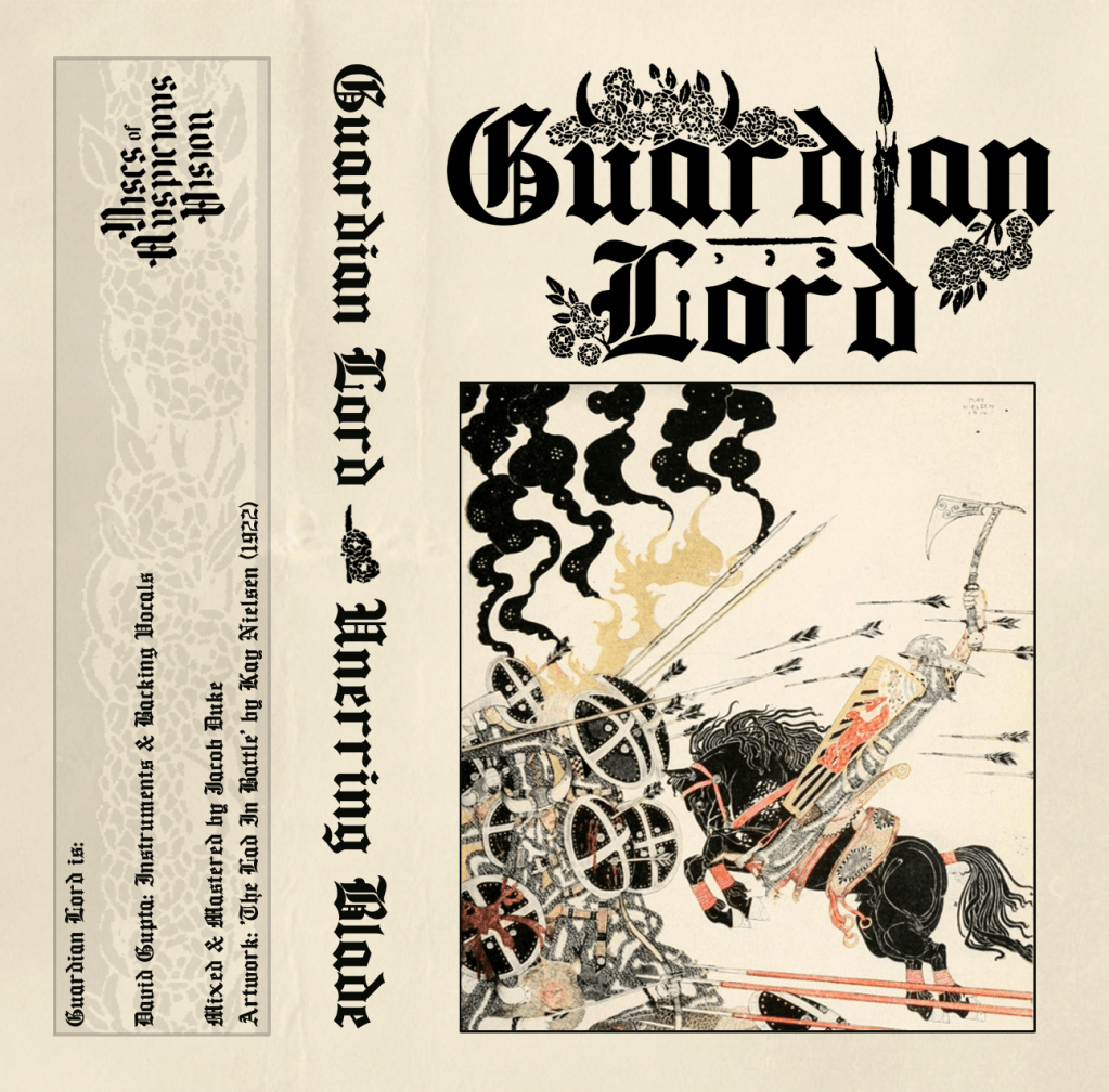
3.1 What’re We Making?
Now for the real shit. I’m not playing with you, so up front, here’s what I’ll be walking you through my process of making: A band logo and a cover/ cassette layout. I’m picking this combo cover/ cassette layout since you can easily make the cassette layout into a 1:1 image to be uploaded to Bandcamp or any other streaming service with little hassle.
3.2 Making The Logo
This whole post is for album art, but here I am, giving you extra advice for making your own logo. For free. Because I love you. Also much of the information here will be relevant to making the album art as well, and we love efficiency.
A quick aside:
The above advice of “just draw it” apply here as well. There are great handdrawn logos out there and simply sketching one out and scanning it might be good enough for what you want. Take a look at Sorcerer’s Sword from the USA. Their hand-scrawled logo from Demo 2021 (which coincidentally I worked on the layout for the cassette release of through Mythic Ironworks) starts off as a scratchy pencil drawn logo and evolves into a digital art asset by the time 2025’s The Wrath of Steel comes out. You’re allowed to start scrappy and small and build from there. Despite the hand drawn logo on the demo, it looks great and translates well into the more etched/ embossed logo on their last album. A good idea and thoughtful execution are all you need.
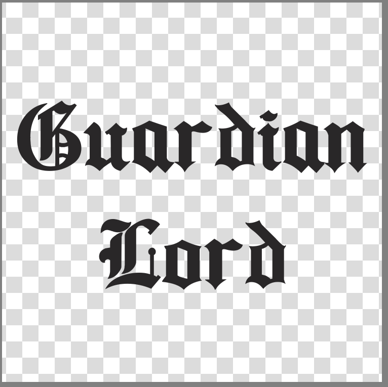
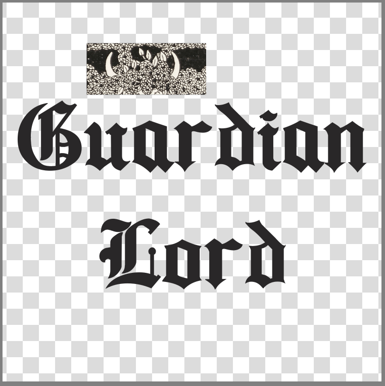
All that being said, this section will cover how I made the Guardian Lord logo above for free, completely digitally. I am not one who prides himself on his manual visual art skills, so working digitally is the way for me. Like I mentioned above, it’s easier to correct mistakes and iterate as you go.
3.2.1 Finding A Font
I know, I know, we all hate the dreaded turn from cool logo to basic font that bands occassionally make, but my goal with Guardian Lord was to try and turn a font into a cool logo.
I knew the project would be fantasy themed old school epic/ heavy metal so I went looking for olde timey fonts to start with. As tired as the aesthetic is now, Bathory‘s iconic gothic font logo is one of the main drivers here for me. I looked at the bands that influenced this project and they all use this aesthetic as their base, so I have a good starting point. I knew I wanted to zazz it up beyond a basic font, but the core form of the logo was to be built around whichever font I picked, so the choice was critical.
I went with a font on DaFont called Ancient, a free variant of Cloister Black. There are tons of font websites you can find, many with fonts categorized easily so you can sort through ’em easily and find one that clicks with you.
Mind the copyright and use allowances for any font you choose. That doesn’t mean you have to obey them, just understand that you might be using someone’s work without a license and whatever befalls you from there may or may not be your fault. Nobody is going to sue the raw black metal band that made 8 dollars on Bandcamp, but understand the choices you make and their potential consequences.
Once you find a font you like, download it! Some sites offer .ttf files only, others may offer more options than that. All you need to do is a quick search online for what file types your computer/ OS can use and how to install a new font. For me, I simply type “Fonts” in my start bar and drag the .ttf file into the Install Fonts area of the resulting window. It installs automatically.
So now we have a font, let’s open up our editor. I’m going to be using Krita.
Open the program and make a new file. You can set the size of the file a whatever you want, but for my uses I typically set it to 1500x1500px and 300 DPI. This ensures your logo is big enough for most basic digital applications– putting it on different artwork or gig flyers and general online posting. Now you’ll be faced with the scariest thing of all. A blank canvas.
Look to the right of the page, you’ll see your project layers. These are the individual elements that can make up your logo. Go ahead and click the little eyeball image next to the layer named “Background”. The entire canvas should turn into a grey and white checkered grid. Good. This is called “alpha” and is the transparent part of the image. When we save this to a .png file, anything showing that checkered portion will be transparent in the final file. That way your logo can be more versatile in how it’s used and you don’t need to do any additional processing later to remove any solid white or black background if you don’t want to.
Time to start typing. Click the Text Tool (the capital T icon on the top left side of the window) and then drag a rectangle onto the canvas. This is making a textbox where you can type whatever you want.
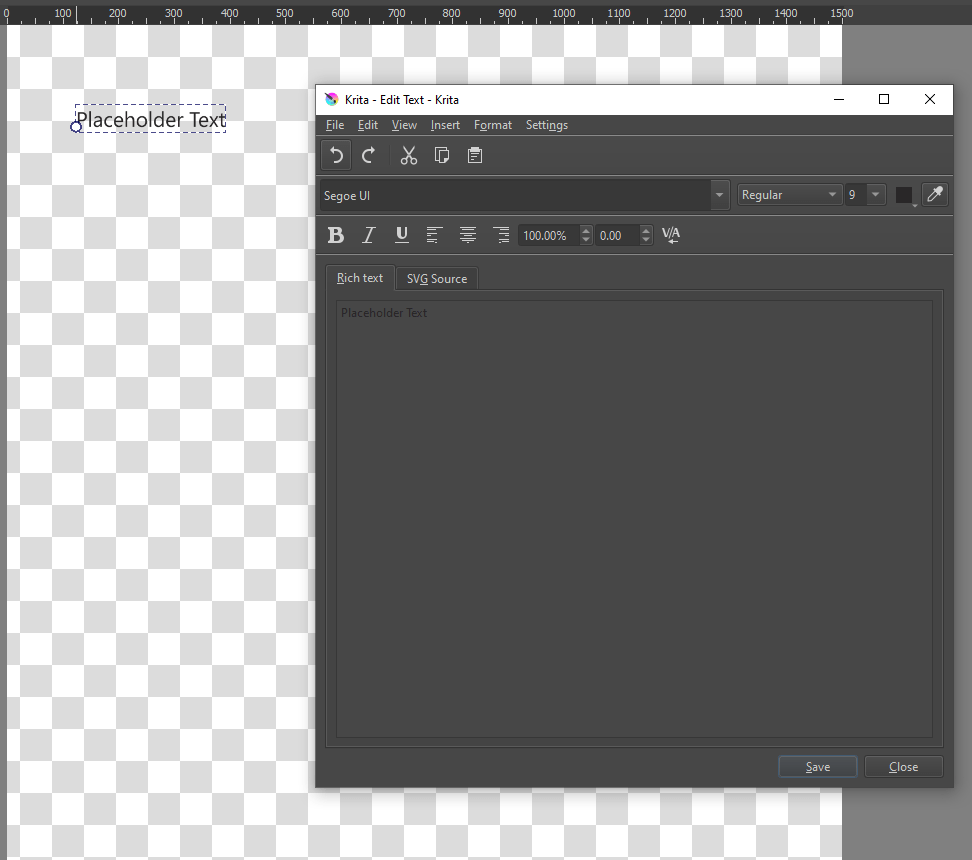
Here is where it works similar to a text editor like Word or Google Docs. You can set the font and the text size, among other settings, so play around and see what works and what doesn’t. In our case we’re going to pick the Ancient font, set the size to 100 and select center justification. I want this logo to be two words stacked on top of each other, since typing out Guardian Lord in one long line will be a bit tougher to use. This is just a creative/ stylistic choice and you can do whatever you think is sick.
Remember to hit Save in the Edit Text window anytime you make changes so they update to the canvas. Play around and try things out. If you close the Edit Text window you can click and drag your new textbox around. You’ll notice that it automatically snaps to the vertical and horizontal centers of the canvas, which makes placing it exactly in the center of the image easy-peasy.
Now it’s time for the fun stuff.
3.2.2 Scouring the PDIA
We want something cooler than just text (although just text can be fine depending on your application), so let’s jump into the Public Domain Image Archive and look for some fun stuff!
When making the Guardian Lord logo I originally searched for various knightly keywords– sword, knight, armour but didn’t find anything that I loved. I ended up searching terms related to nature, since I thought that instead of a regal knight-in-shining-armour vibe, a guardian lord could be a protective magical spirit, maybe a defender of an ancient forest.
While poking around, I ended up just searching the word “border” to see what would come up and I landed on a page from Salomé by Aubrey Beardsley, made in 1894.
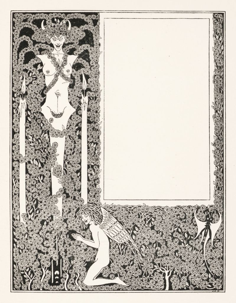
Just look at all that. Vines, trees and flowers, demon horns, candles, little freaks with fucked up eyes. This is the vibe of Guardian Lord. Defender of the forest and all it’s little critters is the way this is going to go.
Take note here, the whole project shifted during the logo making process. That is what making art is all about. Things spontaneously happen and ideas bloom into existence when you get inspired. This would never have happened by entering “heavy metal logo based on old gothic font” into some AI image generator.
From here I just saved this image (remember, it’s public domain!) and opened it in Krita.
3.2.3 Playing Around
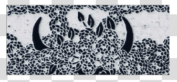
We got our text, and we got our image that we can pull details from to enhance our text. Let’s make a logo. I’m going to show the Guardian Lord logo again and you can take a minute to see what little pieces from Beardsley’s artwork above were chopped and screwed with to fit the logo.
Once you see the original piece and the logo, it’s pretty easy to see how it all came together.
These little bits of filigree were selected using the Rectangular Selection Tool in Krita, your basic drag-to-select function. Pick any spot you think tickles your fancy, then copy and paste it into the logo file open in Krita. It’ll automatically paste the selection as a new layer so you won’t accidentally overwrite anything in there.
You’ll notice that the selection we pasted over doesn’t really match the logo. It is, after all, a scan of a page inked over 100 years ago, so we need to massage it a bit.
First off, I want the horns to be black, not white, so I’m going to hit Ctrl+I to Invert the colours of this layer. You’ve seen this effect hundreds of times, I’m sure, and using what we’re working with here, it’s really just swapping almost-black and almost-white, and turning the soft beige of the page into a cool-toned grey(?). The question mark is there since I’m red-green colourblind. Take any colour advice I give you with a grain of salt. Regardless, now we have this:
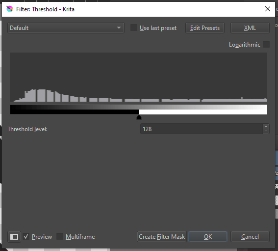
In the top navigation bar, go to Filters, then Adjust, and the two filters we’re looking for are Desaturate and Threshold.
Desaturate will force our image to loose any colour, and be only greyscale. This ensures any subtle bits of colour (remember, I can’t see ’em very well) are squashed and we’re only working with tones of white, grey, and black. From there, the Threshold filter will convert a greyscale image to only black and white. You’ll select at what point in the spectrum of black to white that delineation is happening, and Krita has an option to preview what the filter looks like as you adjust sliders and values, so you can play around and see what works for your vison.
With these filters, I would recommend selecting the option Create Filter Mask instead of just clicking OK. Think of a filter mask as just another layer that only your filter sits on. You can turn it on and off like any other layer. If you just select OK, then the filter is baked into the layer you’re working on. While not inherently bad, it can just be a pain to work with if you decide to roll back some changes or experiment as you go. Krita automatically makes filter masks and layers look like a nested folder/ file system, so it’s pretty easy to see what filters are applied to what, and change them on the fly if you need to.
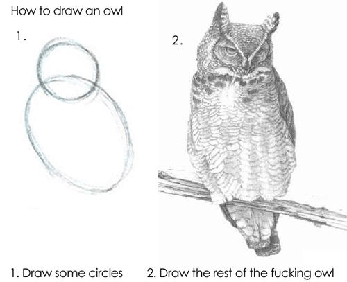
From here, you can move, resize, and erase whatever you want from our layer with the horns to make it fit however you like. Rinse and repeat with the other bits of the logo and voilà, we’re rocking a logo. I know that feels like the “draw the rest of the fucking owl” meme, but I cannot stress enough that what we are doing in this example is literally cutting a pasting fun-looking bits together: something school children do in first grade.
Remember, this can be an iterative process, and working in Krita or some other image editor lets you change things quickly and without having to redo a bunch of work. See below the 2 versions of the Guardian Lord logo that I went through. They are similar, but as you look from one to the other you can see the choices and decisions that were made to make it more readable and balanced.
3.2.4 Show It Off
With any public-facing creative project, getting feedback along the way is always important. Get your friends to tell you what they think of what you made. Good friends should give you honest, quality feedback that can help you decide if you want to revise your work further or not. Remember, it’s your project, so you get final say in what will be released. But also consider you may be too lost in the sauce to remain objective.
It also helps showing it to folks who aren’t into the same stuff as you– sure showing the Guardian Lord logo to a bunch of heavy metal heshers is useful, but it’s also good to show it to a friend or two who aren’t metalheads since they don’t carry the same preconceptions and context. Getting multiple perspectives is important!
3.3 Making The Cover
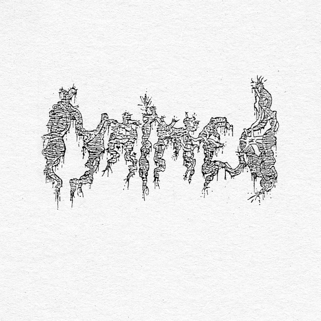
Now that we’ve got a sick logo (remember, you need to be your own biggest fan), we just need the sick cover. You’ve put in a lot of work making your logo look exactly the way you want it to look (something AI can never accomplish wholly), and honestly, just slapping it on a solid colour or textured background can work. Think of all the old demos out there that are just a bomb-ass logo. The cover to Maimed‘s Demo #1 ’91 comes to mind. Their logo rocks and it’s just placed over a subtle paper texture. See above for more examples.
A lot of this process is going to be similar to making the logo, since we’re working in Krita and using the same functions and tools in the program, but there’s a couple other things to keep in mind:
3.3.1 Using Templates
If you’re looking to emulate the layout of a cassette J-card, CD booklet, or record sleeve, you’re going to need some kind of guidance on how to lay out your design. The way the card printing and cutting process works means that there are certain size and positioning constraints that apply to any given cover and covers usually follow these constraints whether you realize it or not.
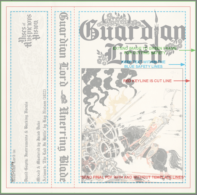
I’m a fan of using the templates from duplication.ca. They offer pretty much any template you can think of for free in multiple file formats. Also, for dummies like me, the templates literally tell you what each section is for and how to ensure the design you make will not be negatively impacted by the printing and cutting process. See below for the template for a 1 panel J-card (left) and the template overlaid on the cassette cover design at 65% opacity (right).
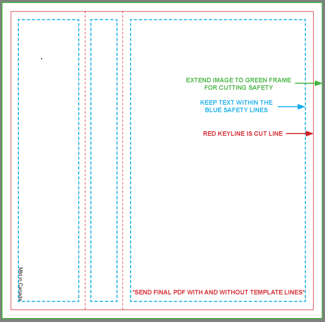
It’s pretty much just colouring in between the lines, ain’t it? See, this whole ordeal is easier than you might have originally thought. Close the ChatGPT tab on your browser right now.
3.3.2 Scouring the PDIA (again)
Second verse, same as the first. Start scrolling through the Public Domain Image Archive for some inspiration and sweet images to pick apart.
For the cover, I wanted to keep the aesthetic of the logo consistent across other elements so on the spine I separated the band name and release name with a flower from the same Beardsley piece used to accessorize the logo. Similarly, on the back flap I took a rectangular section of the same floral design and placed it inside a box, all set to be mostly transparent. In addition to the design of major eye-catching parts of the cover, textures and layering can make for some nice polish and refinement to your design. Note also that at the seams where the J-card would naturally fold to fit into a cassette case I added in some folded paper texture. Maybe this design will end up on a real life J-card some day and that detail might be redundant on a physical object, but for a digital only design it adds to the more natural and “lived in” vibe I’m going for.
Our central image on the front portion of the J-card is yet another public domain image, “The Lad in the Battle” by Kay Nielsen for an early 1900s printing of East of the Sun and West of the Moon. Ultimately I will change this image for another once the music for this project is complete, but for our purposes here it’s a fine choice for a Manilla Road inspired epic heavy metal release. Slap a border around that bad boy to differentiate it from the other elements in the cover and we’re ready to rock.
3.3.3 Size Matters
One last point to touch on here. When rendering out your final design, keep in mind where you’re going to be uploading it. Bandcamp’s design tutrotial calls for a minimum of 1400×1400 pixel image, while still having a maximum file size of 10MB. If you’re using an online distribution platform like Distrokid, their album art requirements recommends an image size of 3000×3000 pixels and explicitly state any non 1:1 image will be cropped. There are other criteria and requirements for their album art uploading process, so be sure to read up on each site’s different requirements and make sure you don’t end up having to rework your artwork multiple times.
And just like that, you have your artwork and it’s ready for submission! I know this post is long and it feels like there’s a lot to consider, but remember the avenues for making art outlined at the beginning. You can literally get your artwork sorted in 5 minutes if you really wanted to, all for free and while exercising your creative muscles and acting on your vision. Yay.
4 Conclusion
I have no eloquent pull quote here for you. Doing real album artwork can actually be very easy and very cheap and very fulfilling. Being an artist making art is one of the best things in this life, and stripping yourself, others, and the culture of that joy is some real sad, hobbyless behaviour.
If you’ve read through everything above and still believe that using AI art for your album cover is a real option worth considering, then I genuinely think you’re a loser. I cannot even fathom how weak your riffs are. Inshallah your project will languish in obscurity forever.
